14 Creative Decor Ideas Above Kitchen Cabinets
The gap above the cabinets sat empty for four years. Not ignored exactly. Just never quite a problem worth solving.
Then a friend visited, looked up, and asked why nothing was there. Not critically. Genuinely curious. As if the empty space had been waiting for someone to notice it could be something else.
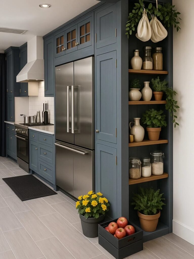
That gap above the cabinets is one of the most visible empty spaces in most kitchens and one of the least thought about. Eye level when standing at the stove. The first thing seen looking up from the island. A horizontal band running the width of the room, doing nothing.
Here are 14 ways to make it do something.
Why the Space Above Cabinets Gets Ignored
The reasons it stays empty:
It feels like storage that was never finished:
- The space looks like it should hold something practical
- Nothing practical fits well (too high to reach easily, too shallow for most storage)
- The indecision: leaves it empty by default
It feels like “extra” rather than “designed”:
- The cabinets: designed
- The counters, the backsplash, the island: designed
- The space above: an afterthought in the original kitchen plan
- Afterthoughts: stay empty longer than anything else
The height makes it feel inaccessible:
- Out of easy reach
- Dusting it: a chore
- The avoidance of maintenance: avoidance of using the space at all
Why It Is Worth Filling
The visual impact:
The horizontal band:
- Runs the width of the kitchen (or the cabinet run)
- At eye level or just above
- Empty: a void that draws attention to its emptiness
- Filled: becomes one of the most-seen design elements in the room
The ceiling height illusion:
- Empty space above cabinets with a gap to the ceiling: can make the ceiling feel disconnected from the cabinetry
- Filled space: visually connects the cabinets to the ceiling
- The kitchen: feels more finished, more intentional
The “collected over time” effect:
- Few single areas communicate “this home has personality” as effectively
- Objects above cabinets: read as accumulated, personal, considered
- The kitchen: less like a showroom, more like a home
The Practical Considerations First
Before choosing what goes up there:
The depth:
- Most cabinet tops: 12–24 inches deep
- Shallow gaps (under 12 inches): limit what fits
- Measure before planning anything large
The height to ceiling:
- Less than 12 inches: very limited options (flat items, small objects)
- 12–18 inches: most common, accommodates most ideas on this list
- 18+ inches: more flexibility, larger objects possible
The dust factor:
- Everything placed here: will collect dust
- Items that are easy to wipe (ceramic, glass, smooth surfaces): lower maintenance
- Items with many crevices (baskets, intricate objects): higher maintenance
- This is not a reason to avoid the space — but it informs the choice
The heat and grease consideration:
- Directly above the stove: heat and grease rise
- Living plants, anything delicate, anything that should not get greasy: avoid directly above cooking areas
- Other sections of the cabinet run: less affected
1. The Curated Plant Collection (Greenery Without Floor Space)
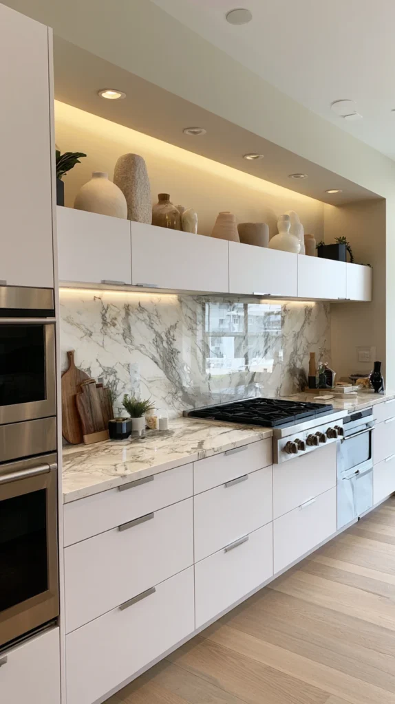
Trailing and upright plants arranged along the cabinet tops — the most-saved idea for this space, and the one that does the most to soften a kitchen’s hard surfaces.
Why plants work so well here:
The trailing effect:
- Plants with trailing growth (pothos, ivy, string of pearls): cascade down from the cabinet top
- The vertical drop: adds a dimension the flat cabinet tops lack
- From standing height: the trailing leaves are at eye level — the most visible part of the plant
The greenery in a hard room:
- Kitchens: predominantly hard surfaces (cabinets, counters, tile, appliances)
- Plants: the most effective softening element
- Above the cabinets: greenery without sacrificing counter or floor space
The light reality:
Most cabinet tops: limited natural light:
- Often the darkest horizontal surface in the kitchen (furthest from windows, closest to ceiling)
- Real plants: need to be chosen for low-light tolerance, or be moved periodically for light
Plants that tolerate low light:
Pothos (most recommended):
- Extremely tolerant of low light
- Trails beautifully
- Forgiving of inconsistent watering
- The most commonly recommended plant for this exact application
ZZ plant:
- Upright, architectural
- Extremely low maintenance
- Tolerates neglect well
- Good for the sections further from windows
Snake plant:
- Upright, sculptural
- Very low light tolerant
- Slow-growing (low maintenance over time)
The faux option:
High-quality artificial plants:
- For sections with no natural light or for those who travel often
- Quality varies enormously — cheap faux plants: obviously fake from any distance
- Good faux plants (often found in higher-end ranges): can be difficult to distinguish from real, especially at the height above cabinets
The arrangement:
Varied heights and pot styles:
- Not all the same pot
- A mix of ceramic, woven, and simple terracotta
- Some plants taller (upright varieties), some trailing
- The variation: prevents a uniform, “matching set” appearance
Grouping with negative space:
- Plants grouped in clusters with gaps between groups
- Not evenly spaced individual plants along the whole run
- The gaps: allow each grouping to be seen as its own arrangement
Cost breakdown:
- Three to five plants (pothos, ZZ, snake plant mix): $30–60
- Pots (varied styles): $25–50
- Total: $55–110
My above-cabinet plants: trailing pothos at each end of the run, with a cluster of upright plants in the centre. Watered every two weeks. The kitchen: noticeably greener without anything on the counters.
Plant Care Tips for This Location
The watering reminder:
- Out of sight: easy to forget
- Set a recurring reminder (phone calendar) for watering
- Pothos and ZZ plants: forgiving of occasional missed waterings — better to underwater than overwater in this spot
Rotating for light:
- Every few weeks, rotate plants closer to a window with those further away
- Even low-light tolerant plants: benefit from occasional brighter conditions
- This: extends the life and health of real plants significantly
2. The Vintage Pottery and Ceramic Display (Collected Character)
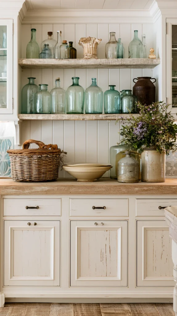
A grouping of vintage or vintage-style pottery, jugs, and ceramic pieces — the display that suggests a collection built over years.
Why pottery collections suit this space:
The “found over time” quality:
- Mismatched pottery: never reads as “bought as a set last week”
- Each piece: appears to have its own history
- The cabinet top: becomes a timeline of acquisitions, real or implied
The colour and texture variety:
Earthy and warm tones:
- Terracotta, cream, sage green, warm brown glazes
- These tones: complement most kitchen colour schemes
- Avoid bright, saturated colours unless they coordinate with an existing accent in the kitchen
Varied glazes and finishes:
- Matte alongside glossy
- Textured alongside smooth
- The variation: prevents the collection from looking like a single purchased set
The pieces:
Jugs and pitchers:
- Often the most characterful shape
- Varying sizes create a natural height progression
- Vintage stoneware jugs: widely available secondhand
Bowls (displayed, not used):
- Large decorative bowls, sometimes nested or stacked
- A bowl too large or too decorative for daily use: perfect for display
Vases (without flowers, or with dried elements):
- An empty vase: still a sculptural object
- With dried botanicals (see idea #4): combines two ideas
Sourcing:
Thrift stores and charity shops:
- The best source for genuinely vintage pieces at low cost
- Each visit: potential for a new addition
- The collection: grows organically (the authentic version of “collected over time”)
Estate sales and flea markets:
- Often a wider range of genuinely old pieces
- Prices vary — some negotiation often possible
New pieces with a vintage aesthetic:
- Many retailers now offer reproduction or vintage-inspired ceramics
- A useful starting point if thrift sourcing is not immediately accessible
- Mix with genuinely vintage pieces over time as the collection develops
The arrangement principle:
Height variation, grouped in odd numbers:
- Groups of three or five
- Tallest piece toward the back or to one side, not centred and symmetrical
- The “museum shelf” effect: pieces appear placed by someone with an eye, not lined up
Cost breakdown:
- Five to seven pieces (mixed thrift and new): $30–80
- Total: $30–80
3. The Basket Collection (Texture and Warmth)
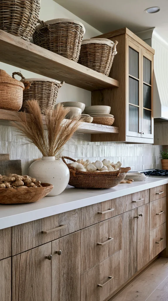
Woven baskets in varying sizes, arranged along the cabinet tops — the natural-material accent that adds warmth to a kitchen dominated by hard surfaces.
Why baskets work specifically above cabinets:
The texture contrast:
- Cabinets: smooth (paint, laminate, or wood with a finish)
- Baskets: woven, textured, organic
- The contrast: makes both surfaces more interesting
The practical-decorative dual purpose:
- Some baskets: purely decorative, displayed for their shape and texture
- Some baskets: can hold seasonal items, spare linens, or rarely-used items (lids fitted, contents hidden)
- The mix: decoration with the option of function
The varieties:
Woven seagrass or rattan baskets:
- Warm, neutral tones
- Widely available
- Suits almost any kitchen style
African market baskets:
- Often featuring bold woven patterns
- More colourful and graphic
- A strong style statement — works particularly well in a kitchen with simple, neutral cabinetry that can handle the visual interest
Vintage wicker:
- Aged, slightly irregular shapes
- Often found secondhand
- The imperfections: part of the character
The arrangement:
Varying sizes in a row:
- Largest to smallest, or largest in the centre tapering to smaller at each end
- A gentle visual rhythm along the cabinet run
Grouped with other elements:
- Baskets alone along the entire run: can feel repetitive
- Baskets interspersed with other ideas from this list (pottery, plants, books): more visually interesting
The lid consideration:
Open baskets:
- Show their woven interior
- Can be used to hold lightweight items (dried flowers, cloth napkins) — visible but not cluttered-looking
Lidded baskets:
- Conceal contents entirely
- Useful for genuinely storing items that need to be up there but are not attractive
- The lid: still contributes to the woven texture and shape
Cost breakdown:
- Four to six baskets (varied sizes): $40–100
- Total: $40–100
4. The Dried Flower and Botanical Arrangement (Low-Maintenance Softness)
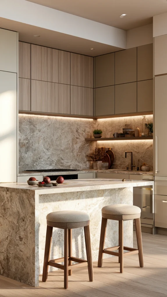
Dried flowers, grasses, and botanicals in vases or simply gathered in bunches — the softening element that requires no watering and no light considerations.
Why dried botanicals solve the low-light, low-maintenance problem:
No care required:
- Above cabinets: often poor light, hard to reach for watering
- Dried botanicals: need neither
- The softness of plant material: achieved without the maintenance
The longevity:
- A dried arrangement: can last months to years with minimal fading
- Far more forgiving than fresh flowers (which would need frequent replacing) or some real plants (which need consistent care)
The materials:
Dried grasses (pampas, bunny tail, wheat):
- Tall, often dramatic
- Pale, neutral tones (cream, beige, soft brown)
- Suit large vases, make a statement with minimal effort
Dried eucalyptus:
- Retains a soft green-grey colour when dried
- Fragrant initially (fades over time)
- A more “fresh” look than pale grasses, while still being dried
Dried hydrangea heads:
- Papery texture, often fade to soft pink, cream, or green tones
- Work well in smaller vases or jugs
- A romantic, vintage quality
Preserved flowers (technically different from “dried”):
- Preserved through a process that maintains more flexibility and colour than air-dried
- More expensive but longer-lasting and often more realistic-looking
- A worthwhile investment for a prominent position
The vessels:
Tall vases for tall stems:
- Pampas grass and similar: need a vase with enough weight/height to support the stems without tipping
- Ceramic or glass: both work
Jugs and pitchers (combines with idea #2):
- A vintage jug with a bunch of dried eucalyptus: combines two ideas in one object
Simple bundles, no vase:
- Some dried botanicals (lavender, wheat) can simply be tied with twine and laid along the cabinet top
- No vessel required
- A more rustic, gathered look
The colour coordination:
Match the kitchen’s warm tones:
- Most dried botanicals: naturally fall into cream, tan, soft brown, dusty green, faded pink
- These tones: complement wood cabinetry, warm white walls, and neutral schemes particularly well
Cost breakdown:
- Dried grasses or eucalyptus bunches: $10–30 each
- Vases (if not already owned): $15–40
- Total: $25–110 depending on quantity and vessels
5. The Vintage Cookbook Stack (Function and Display Combined)
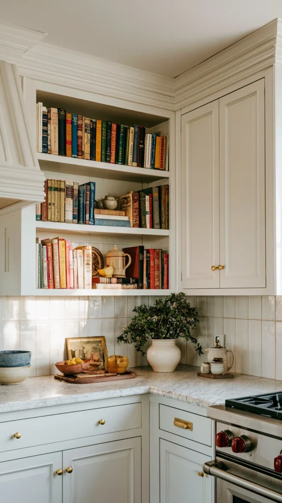
Stacks of vintage or well-loved cookbooks, arranged horizontally — the display that suggests a kitchen used for cooking, not just for show.
Why cookbooks belong above the cabinets:
The narrative:
- A kitchen with cookbooks visible: a kitchen where cooking happens
- The opposite of a “staged” kitchen
- Books: the most personal object category — what is collected says something about the person
The visual quality:
Spines and covers as texture:
- Vintage cookbooks: often have distinctive, sometimes worn covers
- Colours, typography, and textures from different eras: create visual variety
- Stacked horizontally: the spines become a pattern in themselves
The stacking approach:
Height-graduated stacks:
- Larger books at the bottom, smaller on top
- Multiple stacks of varying heights along the run
- Avoids one uniform row (which can look like a library shelf rather than a display)
Stacks with objects on top:
- A stack of books topped with a small object (a vintage scale, a small plant, a ceramic piece)
- The book stack: becomes a “plinth” for another item
- Combines well with ideas #2 and #4
Sourcing:
Thrift stores and secondhand bookshops:
- Vintage cookbooks: often very inexpensive
- Look for interesting covers, era-appropriate design, and a range of sizes
- The content matters less than the visual quality for this purpose (though genuinely useful cookbooks: a bonus)
Personal collection:
- Existing cookbooks, currently in a cupboard or drawer: an immediate, free source
- The personal connection: adds to the authentic, lived-in quality
The colour consideration:
Covers in tones that complement the kitchen:
- Cream, brown, muted colours: blend well
- A few bold or colourful spines: add interest without overwhelming
- If covers clash with the kitchen’s palette: some can be turned spine-in (showing the page edges) for a more neutral, textural look — a technique borrowed from styled bookshelves
Cost breakdown:
- Eight to twelve vintage cookbooks (thrift sourced): $10–30
- Total: $10–30
6. The Oversized Platter and Plate Display (Leaning Against the Wall)
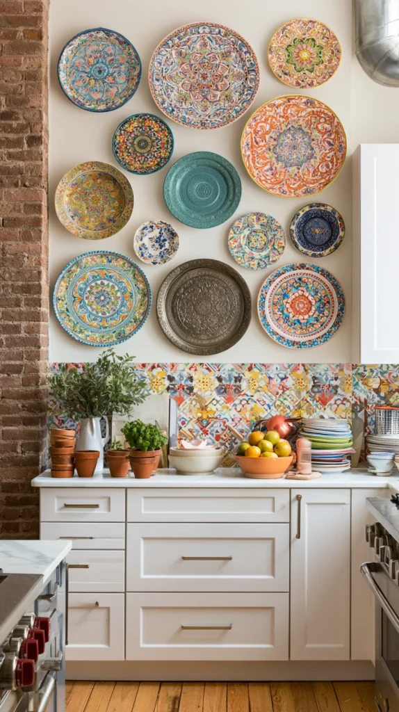
Large decorative plates, platters, or chargers leaned against the wall behind the cabinets — the display that uses height without requiring depth for standing objects.
Why leaned plates work in shallow spaces:
The depth advantage:
- Standing objects (vases, plants): require depth proportional to height (a tall vase needs a wide enough base)
- A plate leaned against the wall: occupies minimal depth regardless of its diameter
- Particularly useful for shallow cabinet tops (under 12 inches)
The visual height:
Large plates create height without bulk:
- A 14–16 inch decorative platter, leaned upright: adds significant visual height to the display
- Without the visual weight of a large solid object
The styles:
Patterned ceramic plates:
- Transferware, botanical prints, patterned vintage plates
- The pattern: visible even from a distance (across the kitchen)
- A single striking plate: can anchor an entire grouping
Wooden boards and platters:
- Large wooden cutting boards or serving boards, leaned upright
- Warm, textural, complements wood cabinetry or flooring
- Combines well with idea #5 (the wooden board as a “stack topper” alternative)
Mixed metal trays:
- Vintage metal trays (brass, copper, painted tin)
- Catch light, add a different material to the mix
- Particularly effective if there is existing brass or copper hardware in the kitchen
The arrangement:
Overlapping for depth:
- One large plate at the back, a smaller plate or object slightly in front and overlapping
- Creates a sense of depth even in a shallow space
- The “layered” look: more visually rich than a single flat plate
Plate stands (optional):
- Small plate stands or easels: hold a plate at a slight angle without leaning against the wall
- Useful if the cabinet top has some depth and a freestanding display is preferred
- Otherwise, simply leaning against the wall (with a small museum putty dot for stability) works well
Cost breakdown:
- Two to four large decorative plates/platters (thrift or new): $20–60
- Optional plate stands: $10–20
- Total: $20–80
7. The Wine and Spirits Display (Functional Glamour)
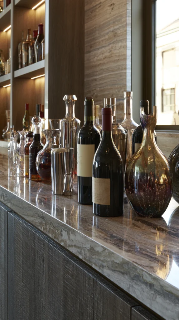
Bottles of wine, interesting spirits, or decorative bar items displayed along the cabinet tops — the idea that turns storage into styling for kitchens that double as entertaining spaces.
Why this works above cabinets specifically:
The height advantage for bottles:
- Wine and spirit bottles: tall, narrow — well-suited to a horizontal band of space
- Visible without taking up counter or cabinet interior space
- A practical solution for kitchens without dedicated bar storage
The visual appeal:
Bottle shapes and labels as design:
- Wine bottles: vary in shape (Burgundy, Bordeaux, Champagne shapes all differ)
- Labels: often beautifully designed, adding colour and pattern
- A row of varied bottles: visually similar to a row of vases in terms of the rhythm they create
What to display:
Wine bottles (a working “display” — not a permanent fixture):
- Bottles intended to be opened eventually
- The display: refreshes naturally as bottles are used and replaced
- Avoid displaying bottles that should be stored on their sides for long-term aging (display position: upright, fine for bottles intended for nearer-term drinking)
Decorative spirit bottles:
- Interesting-shaped bottles (some gins, whiskies, and liqueurs come in distinctive bottles)
- Empty decorative bottles: can also be kept purely for their shape, filled with water or oil for visual weight if needed
Bar accessories:
- A cocktail shaker, a set of vintage glasses (upside down, for dust protection), an ice bucket
- Adds variety beyond just bottles
The practical considerations:
Heat:
- Wine: ideally stored in a stable, cooler environment for long-term keeping
- Above kitchen cabinets: often warmer (heat rises)
- This idea: best suited to bottles that will be consumed relatively soon, not a long-term wine storage solution
The grouping:
Varied heights and shapes:
- Tall wine bottles, shorter spirit bottles, an ice bucket or shaker for a different shape entirely
- Grouped rather than in a single row: more visually interesting
Cost breakdown:
- No additional cost if using existing bottles
- A few decorative empty bottles or bar accessories (if desired): $15–40
- Total: $0–40
8. The Seasonal Rotation Display (A Space That Changes)
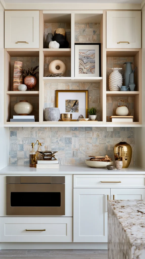
A dedicated section of the cabinet top reserved for seasonal decor that changes through the year — the idea that keeps the space feeling fresh and connected to the calendar.
Why a rotating display adds more value than a static one:
The “noticed again” effect:
- A permanent display: eventually becomes invisible (the eye stops registering it)
- A display that changes every few months: re-noticed each time it changes
- The space: stays relevant rather than fading into the background
The seasonal connection:
- Many kitchens: lack any seasonal decor at all, or seasonal decor is confined to a mantelpiece or front door
- Above the cabinets: an additional space for seasonal expression without disrupting the main display
The approach:
One section, not the whole run:
- Most of the cabinet top: a permanent display (plants, pottery, books — any combination from this list)
- One section (often near a window, or one end of the run): reserved for seasonal items
Seasonal ideas:
Spring:
- Fresh or faux blossom branches in a tall vase
- Pastel-toned ceramics
- A small nest or egg-themed object (subtle, not overtly themed)
Summer:
- Bright dried flowers or grasses
- A bowl of (real or faux) lemons or citrus
- Lighter, brighter colours generally
Autumn:
- Dried seed heads, wheat, or autumn leaves (pressed or dried)
- Pumpkins or gourds (real, for a limited season, or faux for longevity)
- Warm, deep tones — rust, mustard, burgundy
Winter:
- Evergreen branches or sprigs
- Pinecones
- Candles (if positioned safely, away from anything flammable and not directly under cabinets in a way that traps heat)
The storage of off-season items:
A dedicated box or bin:
- Off-season decor items: stored in a labelled box
- Kept somewhere accessible (not requiring a major excavation each season)
- The rotation: easy enough that it actually happens, rather than becoming another task that gets postponed indefinitely
Cost breakdown:
- Initial seasonal items (spread across the year, a few per season): $10–30 per season
- Storage box: $10–15
- Total: $50–135 across a full year, or start with just one season
9. The Architectural Salvage Display (Found Objects With History)
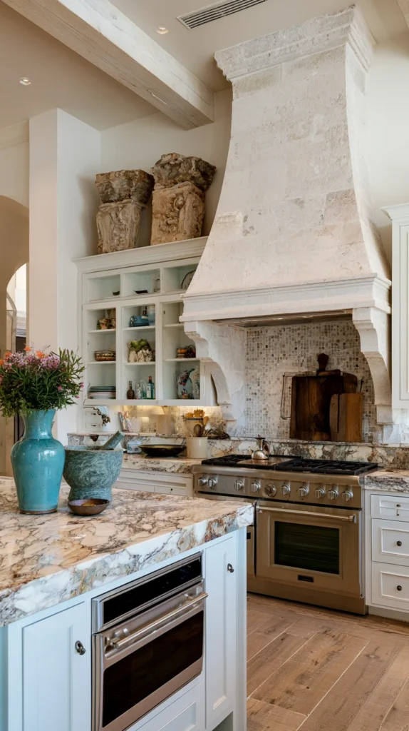
Old architectural pieces — corbels, finials, weathered signs, vintage tools — displayed as sculptural objects — the idea for a kitchen wanting a sense of history and one-of-a-kind character.
Why architectural salvage suits this space:
The sculptural quality:
- Many salvage pieces: were never intended as decor, but have inherently interesting forms (corbels, brackets, mouldings)
- Displayed above cabinets: read as sculpture
- The unexpectedness: makes them more interesting than purpose-made decorative objects
The patina:
- Aged wood, weathered metal, worn paint
- These textures: cannot be replicated by new objects (or only at significant cost for “aged” reproductions)
- Genuine age: visible and adds authenticity
The types of objects:
Corbels and brackets:
- Originally architectural supports (for shelves, eaves, etc.)
- Often carved or shaped decoratively
- Displayed flat or upright: interesting forms even without their original function
Old signs:
- Painted wooden or metal signs (shop signs, advertising signs, directional signs)
- Letters and numbers: graphic and characterful
- Faded paint: adds to the appeal
Vintage tools:
- Old kitchen tools, woodworking tools, or garden tools with interesting shapes
- A row of old wooden-handled tools: textural and characterful
- Particularly fitting in a kitchen with a “farmhouse” or “rustic” leaning
Weathered wooden objects:
- Old crates, boxes, or wooden implements
- Worn, faded, sometimes with remnants of old paint or stencilled text
- Add texture and history
Sourcing:
Architectural salvage yards:
- The primary source for genuinely old building elements
- Prices vary — some items inexpensive, others (depending on rarity) more costly
- Worth visiting in person — photographs rarely do these pieces justice
Estate sales and antique markets:
- Vintage tools and smaller objects: often found here
- More affordable than dedicated salvage yards for smaller items
The arrangement:
Sparse rather than crowded:
- Salvage pieces: often have more visual weight individually than smaller decorative objects
- Fewer items, more space around each: lets each piece be appreciated
- Avoid crowding multiple large salvage pieces together — the effect becomes cluttered rather than curated
Cost breakdown:
- Two to four salvage pieces (varies enormously by item and source): $20–150
- Total: highly variable, $20–150 for a modest start
10. The Decorative Lighting Accent (Illuminating the Space)
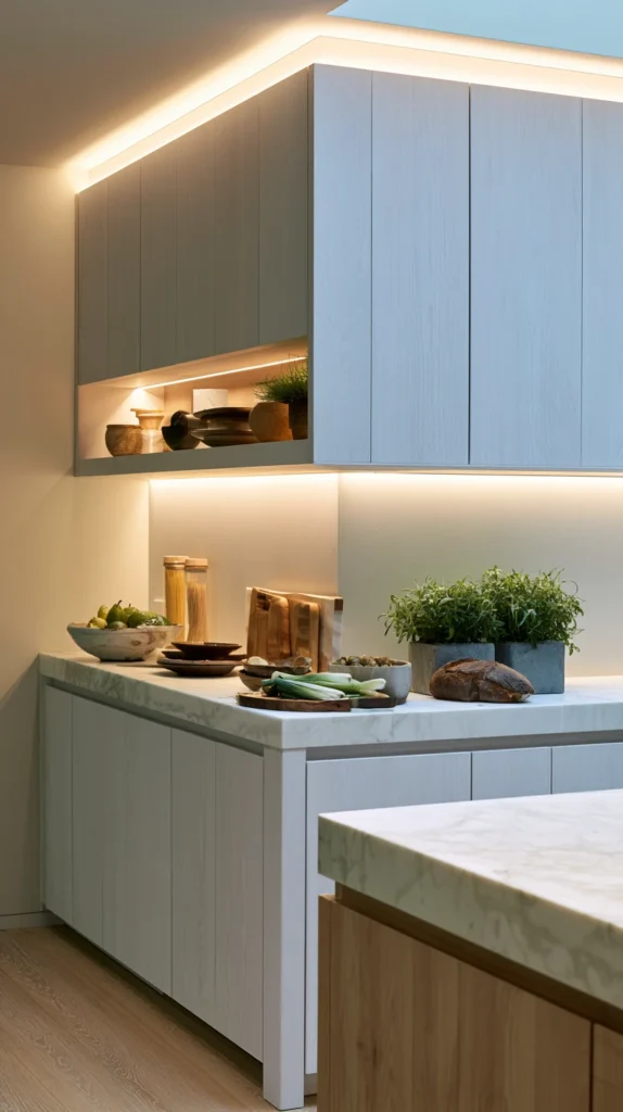
Small lights — string lights, picture lights, or LED strips — installed along or above the cabinet display — the idea that adds a layer of warmth and draws attention to whatever else is displayed.
Why lighting elevates every other idea on this list:
The “seen at its best” effect:
- Any display: looks better with appropriate lighting
- Above-cabinet spaces: often poorly lit by the kitchen’s main lighting (which is usually directed at counters and the room generally, not upward)
- Added lighting: makes the display the focus, especially in the evening
The warm glow above:
- Light coming from above the cabinets, directed up toward the ceiling or down onto the display: creates an ambient glow
- Particularly effective in open-plan kitchens, where this glow is visible from adjoining living spaces
The lighting types:
LED strip lighting (most practical):
- Thin LED strips, installed along the front edge of the cabinet top (hidden from direct view, light spilling onto the display and/or up to the ceiling)
- Low profile, relatively simple to install (many are plug-and-play with adhesive backing)
- Warm white (2700K–3000K): essential — cool white light here can feel clinical
Picture lights:
- Small, directional lights (often battery-operated or plug-in) angled to highlight specific objects
- More targeted than strip lighting
- Suits a display with one or two “hero” objects (a striking plate, a significant piece of pottery)
String lights (more casual):
- Warm white string lights, woven among plants, baskets, or other objects
- A softer, more casual look than strip or picture lighting
- Particularly suited to a more relaxed, eclectic display style
The practical considerations:
Power source:
- Hardwired lighting: requires an electrician, most permanent and clean solution
- Plug-in with a cord routed down the back of the cabinets: more accessible, less invasive
- Battery-operated: simplest, but requires battery changes — best for lower-use accent lighting
Heat above cooking areas:
- If installing lighting near the stove area: ensure any lighting is rated for the conditions (heat, potential grease) in that zone
- LED strips: generally run cool, but always check manufacturer guidance for kitchen use
The effect at different times of day:
Daytime:
- The lighting: largely invisible (ambient room light dominates)
- The display: relies on its own visual qualities
Evening:
- The lighting: becomes the dominant light source for that area
- The display: takes on a different character — warmer, more dramatic
- A kitchen with above-cabinet lighting: often the source of the room’s evening ambient light, alongside or instead of harsher overhead lighting
Cost breakdown:
- LED strip lighting kit (warm white, with remote or app control): $20–50
- Picture lights (pair): $30–80
- String lights: $10–25
- Total: $10–80 depending on type chosen
11. The Family Photo and Art Display (Personal History on Show)
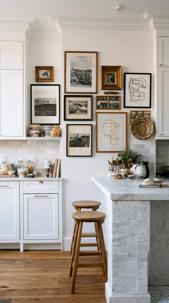
Framed photographs, children’s artwork, or small pieces of art arranged along the cabinet tops — the most personal of all the ideas on this list.
Why this space suits personal display:
The height advantage:
- Family photos at eye level on a shelf or sideboard: common, but the kitchen often lacks such surfaces
- Above the cabinets: a horizontal surface at a height that works for small framed pieces
- Visible without being at a height where they are constantly handled or knocked
The personal layer:
- Of all the ideas on this list, this is the one that makes the kitchen unmistakably “this family’s kitchen”
- Cannot be replicated or purchased — the personal content is the point
What to display:
Framed family photographs:
- A mix of formal and casual photos
- Frames: ideally coordinated (same colour or material family) even if the photos themselves are varied
- Black and white or sepia-toned photos: tend to look more cohesive as a group than a mix of full-colour images
Children’s artwork (selected pieces):
- Not every piece — a rotating, curated selection
- Simple frames: elevate children’s drawings significantly
- A changing display: keeps it current as children grow and produce new work
Small original art or prints:
- Botanical prints, simple line drawings, watercolours
- Smaller pieces: suit the often-limited depth of cabinet tops
- Leaned against the wall (similar to idea #6) rather than requiring hanging
The frame coordination:
One frame style and colour:
- The simplest way to make a varied collection of images look cohesive
- All black frames, or all natural wood frames, or all white frames
- The frame: the unifying element when the contents vary widely
The arrangement:
Leaned, overlapping:
- Frames leaned against the wall, slightly overlapping
- Easier to update than hanging (no new holes needed when photos change)
- A more casual, “gallery in progress” feel
Combined with other objects:
- A framed photo beside a small plant, or in front of a stack of books
- Avoids the display becoming only about the photos — integrates with the rest of the cabinet-top styling
Cost breakdown:
- Frames (5–8, coordinated): $30–80
- Total: $30–80 (photos and artwork: typically already owned)
12. The Copper and Brass Cookware Display (Warm Metal Accents)
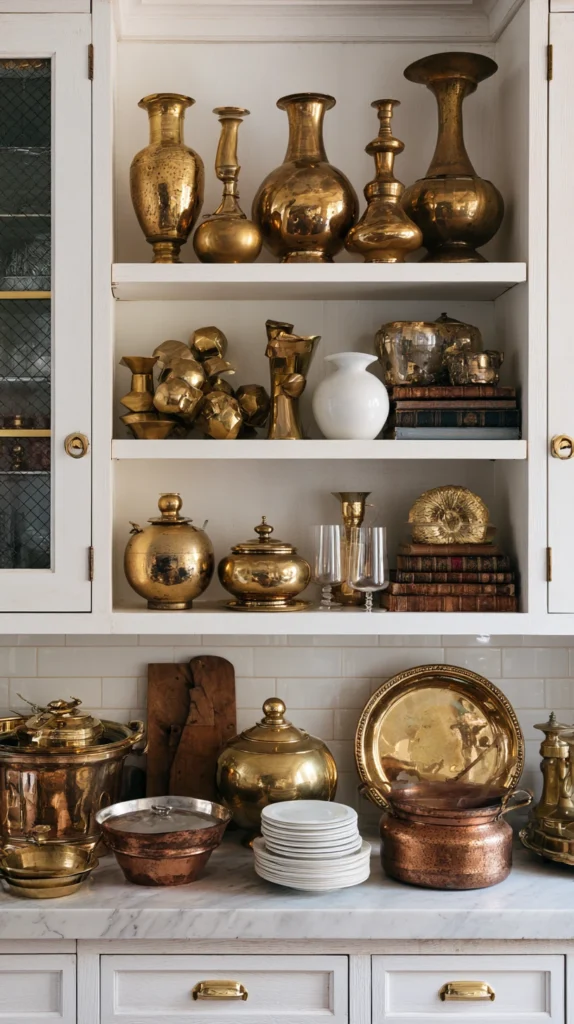
Copper pots, brass kitchen tools, or other warm-metal cookware displayed along the cabinet tops — the idea that adds warmth and shine to a kitchen, drawing on a long tradition of displaying cookware as decor.
Why copper and brass work above cabinets:
The reflective quality:
- Copper and brass: catch and reflect light
- Positioned above cabinets, often near (or illuminated by, see idea #10) light sources: the metal gleams
- Adds a different visual quality than matte ceramics or woven baskets — shine and warmth
The traditional kitchen reference:
- Hanging or displayed copper pans: a long-standing kitchen tradition, particularly in French country and traditional kitchen styles
- Above the cabinets: a contemporary adaptation of this tradition (rather than hanging from a rack, which requires different installation)
What to display:
Copper pots and pans:
- Vintage copper cookware: often has a beautiful, uneven patina
- Polished copper: bright and reflective
- Unpolished, naturally aged copper: warmer, more muted — both are valid choices depending on the desired look
Brass kitchen scales, measures, or tools:
- Vintage brass kitchen scales: a classic decorative kitchen object
- Brass measuring cups, old brass tins or canisters
- Smaller items: can be grouped together for visual weight
Mixed copper and brass:
- The two metals: closely related in tone, mix well together
- A copper pot beside a brass canister: a cohesive metal “family” while still offering variety in shape
The patina decision:
To polish or not:
- Polished: bright, formal, more “display piece”
- Unpolished/aged: warmer, more casual, more “well-used object”
- Either is correct — the choice depends on the overall kitchen style
- If unpolished: the patina will continue to develop naturally over time (this is usually desirable, not something to prevent)
Sourcing:
Vintage copper cookware:
- Widely available secondhand (thrift stores, markets, online)
- Often less expensive than new copper cookware of comparable quality
- Dents and wear: add character, do not detract from display value
The arrangement:
Varying sizes, similar tone:
- A large copper pot, a smaller copper pan, a brass canister
- All warm-metal tones: cohesive despite varied shapes and sizes
- Grouped rather than spread individually along the entire run
Cost breakdown:
- Two to four copper/brass pieces (vintage sourced): $20–80
- Total: $20–80
13. The Sculptural Object Display (One Statement Piece)
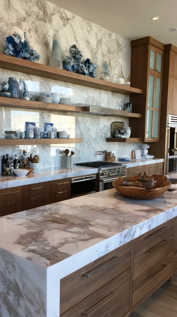
A single large, sculptural object as the primary feature of the cabinet top — the minimalist approach, for kitchens where one well-chosen piece says more than many smaller items.
Why one large piece can outperform many small ones:
The “less but better” principle:
- A collection of many small objects: requires curation, dusting, and ongoing arrangement
- One large, well-chosen piece: requires none of this ongoing attention
- For kitchens with a more minimalist aesthetic, or for those who prefer low-maintenance styling: one piece is often the better choice
The visual impact:
Scale creates presence:
- A single large object: has a presence that many small objects, even combined, may not achieve
- In a long cabinet run: one large piece, positioned thoughtfully (not necessarily centred — often more interesting closer to one end), can anchor the entire space
What works as a single statement piece:
A large ceramic vessel:
- An oversized vase, urn, or jar — without need for flowers or contents
- The form itself: the decoration
- Often available in ceramic, in earthy or bold glazes
A large piece of art, propped:
- One substantial framed piece or canvas, leaned against the wall
- Larger than the “leaned plates” of idea #6 — this is the primary focus, not part of a grouping
A architectural or sculptural object:
- A large piece of driftwood, an interesting root form, a substantial carved object
- Organic, sculptural forms: particularly effective as a single statement, where multiple such pieces might compete
A vintage sign or large lettering:
- A single word or short phrase, in large dimensional letters or a vintage sign
- Personal or meaningful (a family name, a place name with significance) rather than generic kitchen phrases
The positioning:
Not necessarily centred:
- A single piece, positioned at roughly the golden-ratio point along the run (around a third or two-thirds of the way along, rather than dead centre) often feels more deliberate and less rigid than perfect centring
With breathing room:
- The point of a single statement piece: the negative space around it
- Resist the urge to add smaller items “to fill the rest of the space” — the emptiness is part of the design
Cost breakdown:
- One substantial ceramic vessel or sculptural object: $40–150
- Total: $40–150 (highly variable depending on the piece chosen)
14. The Mixed Curated Vignette (Combining Multiple Ideas)
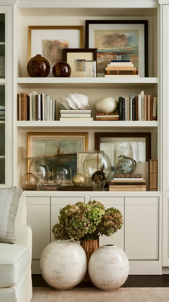
A thoughtfully combined arrangement drawing from several of the previous ideas — the approach most interior designers would actually use, and the one that produces the richest result.
Why combination beats single-category displays:
The real-world observation:
- Genuinely “collected” spaces: rarely contain only one type of object
- A shelf of only plants, or only books, or only pottery: can look like a themed display rather than an organic collection
- A mix: books, a plant, a piece of pottery, a leaned plate — reads as authentically personal
The principles for combining:
A unifying element:
- Despite the variety of object types, something should tie them together
- Most common unifying elements: colour palette (everything in warm neutral tones, for example) or material family (everything in natural materials — wood, ceramic, woven, dried botanicals)
- Without a unifying element: variety becomes visual chaos rather than richness
The “vignette” structure:
Group in clusters of three to five objects:
- Each cluster: a mini-arrangement (similar to how a stylist would arrange a single shelf)
- Multiple clusters along the cabinet run, with gaps of negative space between them
- Each cluster: varies in height, has a “tallest” element, and includes at least one item that breaks the expected pattern (a plant among pottery, a book stack among baskets)
An example combined arrangement (left to right along a cabinet run):
Cluster one:
- A tall trailing plant in a ceramic pot (idea #1)
- A stack of two vintage cookbooks beside it (idea #5)
- A small vintage jug on top of the books (idea #2)
Gap (negative space)
Cluster two:
- A large leaned decorative plate (idea #6)
- A woven basket in front of it, slightly overlapping (idea #3)
- Dried eucalyptus in a small vase beside the basket (idea #4)
Gap (negative space)
Cluster three:
- A single large sculptural ceramic vessel (idea #13), given its own space at the end of the run
The lighting tie-together:
One lighting treatment for the whole run:
- Whether LED strips, picture lights, or string lights (idea #10)
- Applied consistently along the entire cabinet top
- Ties the varied clusters into one cohesive overall display, even though each cluster has its own character
The maintenance approach:
Periodic refresh, not constant change:
- A combined vignette: does not need to change often to stay interesting (unlike idea #8’s seasonal rotation, though the two can be combined)
- A periodic refresh — every few months, swapping a few items, adding a new thrifted find, removing something that no longer feels right — keeps the display evolving without requiring constant attention
Cost breakdown:
- Drawing from multiple ideas above, a combined approach across a full cabinet run: $80–250
- Total: $80–250, depending on which combination of elements and how many are sourced versus already owned
What All 14 Ideas Share
The principles that apply regardless of which idea (or combination) is chosen:
Negative space matters:
- Every idea, even the most “filled” options, benefits from gaps and breathing room
- A cabinet top filled edge-to-edge with no variation in height or grouping: busy rather than curated
- Leave space. The space is part of the design.
Height variation creates interest:
- Whether plants, pottery, books, or a single statement piece — variation in height along the run prevents a flat, monotonous line
- Even a single object benefits from being paired with something taller or shorter nearby
Scale relative to the space:
- Very small objects: can get lost in a large space, or look like clutter in a small one
- Match the scale of objects to the scale of the cabinet run — a long run: can support larger groupings or a few substantial pieces; a short run: often better with one or two well-chosen items rather than many small ones
Consider maintenance honestly:
- Every item placed here: will need occasional dusting or attention
- Choose based on how much maintenance is realistically going to happen
- Lower-maintenance choices (ceramics, dried botanicals, sculptural pieces) for those who want a “set and forget” display; higher-maintenance choices (real plants, frequently rotated items) for those who enjoy the ongoing engagement
Getting Started This Weekend
The lowest-cost, lowest-risk starting point:
Clear and assess.
Before adding anything, clear the space completely (if anything is currently there) and clean it. Standing back, look at the empty run:
- How deep is it?
- How much height is there to the ceiling?
- Which sections get any natural light?
- Which section is closest to the stove (avoid delicate items there)?
The first addition:
One plant, one stack of books, one piece of pottery.
Three objects. Different heights. Positioned together at one end of the run, not spread along the whole length.
Cost: $20–50 depending on what is already owned.
Live with it for a week.
Notice whether it gets dusty quickly (informs future material choices), whether it catches the light well (informs whether lighting, idea #10, would help), and whether the scale feels right for the space.
Then expand.
Add a second cluster at the other end. Then, if desired, something in the middle. The space fills gradually, the way real collections actually form.
The gap above the cabinets was never really a problem. It was an opportunity that had not yet been noticed. Once it is filled — even partially, even simply — the kitchen looks different in a way that is hard to point to specifically, but impossible to miss once it has happened.
That is the entire result. Worth the weekend.